

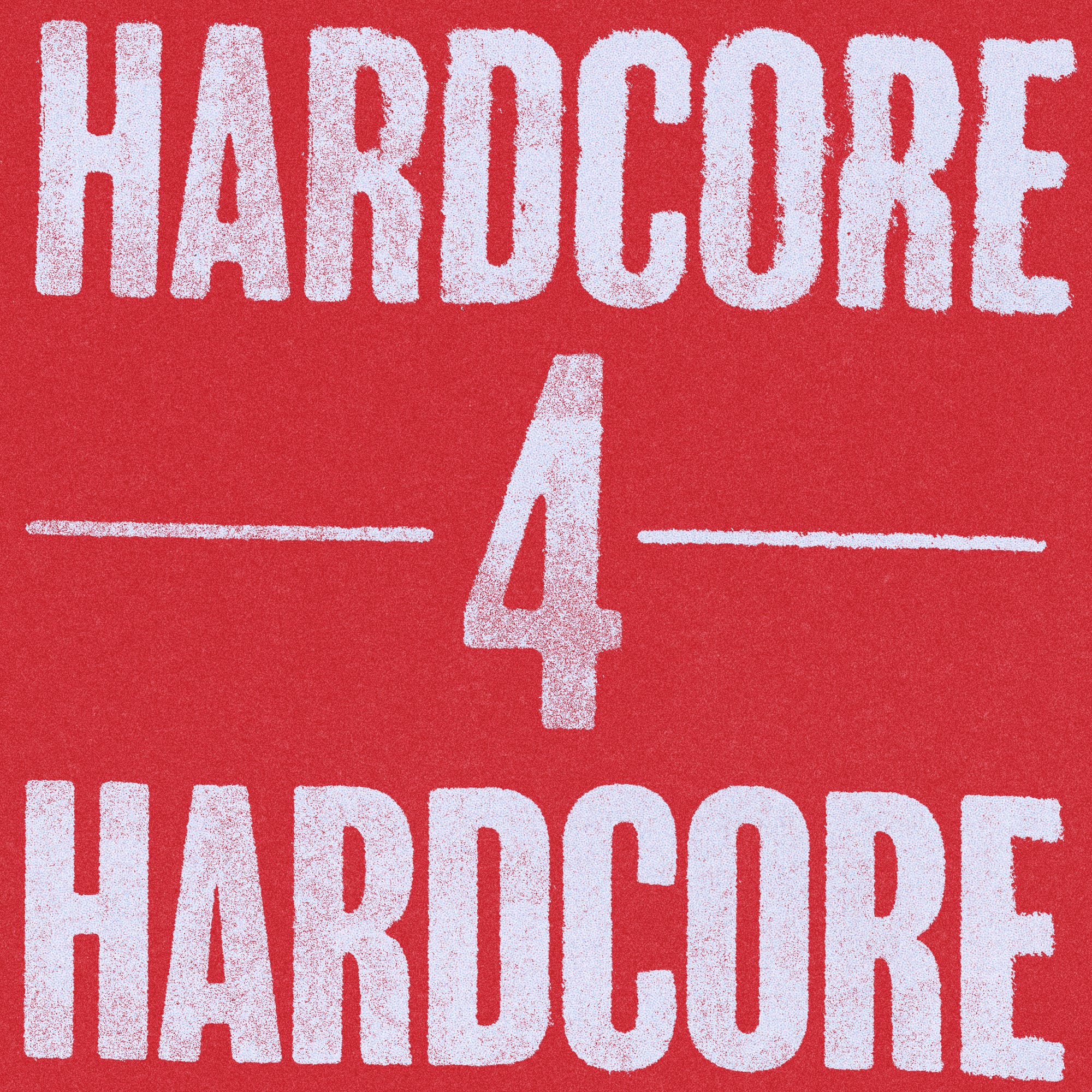
Hardcore For Hardcore
The genre that shaped my personal style in graphic design

People always talk about personal style in graphic design, and I’ve gotten remarks about mine ever since I started studying it. It was always a tough thing for me to grasp. I think that if you’re an illustrator/painter/artist etc, your style is a lot clearer than when you do graphic design. Especially in my case. If you look at my portfolio it’ll make sense: from restaurants all over the world to techno DJ’s, singer-songwriters, a beauty and fashion podcast, a basketball tournament, a local ice cream parlor, … You get where I’m coming from, there’s so much variation in subjects and target audiences, I can’t just work in one style.
Wether graphic design is art or communication is a question I don’t want to get in to right now. This one’s about style. The style I work in differs from project to project but what remains the same is my approach. And that approach is something I learned from one of the coolest music genres in the world.
Note: I originally wrote this as a newsletter last year, but made some changes to share it on this platform.
Around the time I started studying graphic design (in high school) is also the same time I started going to hardcore punk shows. I was 14 back then, and I’m 33 now. Two things that have been consistently in my life for almost 20 years.
I remember my first hardcore show very vividly. Growing up near the Belgian coast, there wasn’t much to do. Luckily, I was into skateboarding which was the gateway to pretty much everything I still love. One summer, I joined some friends to go to a local skateboarding competition at the beach. Once the competition was over, a couple of local bands played short 20 minute sets. That was my introduction to hardcore. A few weeks later, I ended up at another hardcore show, this time around it was in a local youth centre. I walked in while Justice (obviously not the electronic music duo) was playing and all I saw was people jumping on each other’s head, even using pool floats. After Justice, True Colors took the stage. The purest form of energy I’ve ever seen on a stage. I was hooked. (I actually got to design merch for True Colors’ reunion show in 2022, talk about a full circle moment.)
After that, hardcore shows pretty much filled up my weekends for the next few years. Very thankful to have grown up in the era that had a really active hardcore scene. One thing that always stuck out at hardcore shows is the fact that there were no barriers. In a very literal way, the crowd and the band are one, sharing the energy on-and-off stage which is what makes a hardcore show so different from any other genre. While that comes with a few bruises and the occasional black eye, there’s also the fact that the ‘no barriers’ attitude is something the scene always had and still has. I’ve met members of pretty much all of my favorite bands. Wether they were selling their merch at the merch stand, or moshing to the bands playing before them.
It’s a very special thing to meet the frontman of your favorite band as a 16 year old, because it creates the feeling that you’re mutuals, and you can do it too.
DIY - the most important ethos of hardcore. Wether it’s about starting bands, booking shows or doing anything else. Do it.
I studied graphic design in high school, and the focus was always on all the technical stuff, and making everything as crisp and perfect as possible. Which to me, seemed very boring, which had everything to do with the fact that I was obsessed with hardcore. In the genre, the aesthetic was very gritty, raw, analogue and straight forward. Most people I knew that were making the ‘designs’ weren’t designers, they just worked with what they had and used a xerox, scissors and glue as their main design tools - just like when the genre first started in the 80s.
I started my first fanzine when I was around 17 years old if I remember correctly. Together with a friend, we interviewed some of our favorite bands and bundled everything in a simple black and white magazine which we sold at shows. That might’ve been my first real design project as well. Definitely not my best. What I did there, was apply what I learnt in school to the aesthetic I loved. Which basically meant I tried to recreate the DIY and analog style through design programs.
Something I’d never do now, and never did afterwards. What’s so special about the DIY aesthetic of hardcore and punk is that it was never forced. It was created with the tools they had, which is what I believe is real creativity. Having limited resources and skills, and being creative with the bare minimum is where originality really shines through.
That’s where a lot of elements that would make up my ‘style’ come from, and especially where my approach comes from. I work with a lot of analog ‘techniques’, and embrace the element of surprise in those. My €100 scanner I got 7 years ago is still my best friend, and so is my box of cheap markers. The material doesn’t matter.
I figured I’d show some references of covers that have shaped my taste not only in this genre of music, but also in what I love visually. These are some of the ones that come to mind instantly.


I tried to think of 4 albums that would sum up the genre to me. All different sounds, and all different aesthetics with one thing at the forefront: raw emotion.


The Cold World LP could’ve been a hip hop album cover (if you don’t know the band - listen, they have so much hiphop elements in the right way too!) but the real winner here is Blacklisted’s Heavier Than Heaven, Lonelier Than God. The photograph of the man standing near the water. Not just one of my favorite albums of all time, but the cover is perfection. This is a very emotionally heavy album about heavy topics, and the cover is a perfect fit. Aged very well.


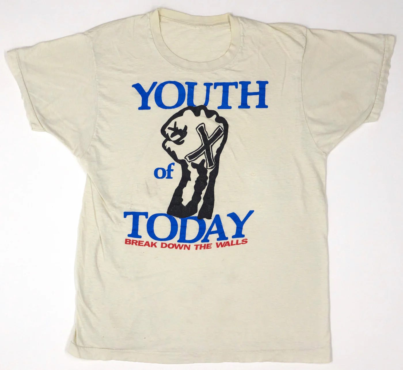
‘Break Down The Walls’ came out in ‘86. It’s 2024 now and that cover is still some of the best graphic design I’ve ever seen. The colors, the typography, the live photo… Perfection! Probably explains where my taste in typography and color combinations comes from. Together with that Start Today cover, these are probably two of my favorite album covers ever.
Another very important aspect of hardcore’s visual language is merchandise. Seriously, no genre does T-shirts better.
My favorite shirt ever is probably Youth Of Today’s ‘X’ design. If you have a shirt that released in the 80’s and is still getting reprinted constantly, you know it’s a good one. I don’t know how many versions I have in my closet, all I know that is everytime I come across an affordable one, I’ll pick it up again and again. I actually have the x’ed up fist tattooed on my arm.
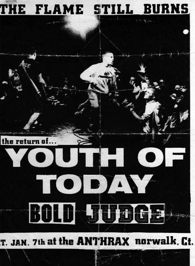
Youth of Today released ‘The Flame Still Burns’ in 1988, and it’s safe to say that in 2025 - it still does. Hardcore is in a really, really good place right now. And while I could say it never left, I’d be delusional if I didn’t acknowledge the fact that the scene was a lot smaller and a lot less buzzing a few years ago.
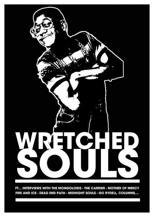
Below, there’s some examples of current bands doing merch right. It’s easy to get caught up in nostalgia when writing something like this, but there’s so many current bands that deserve their flowers. All these also make great music, just saying.


This originally included a playlist, but it’s gone now (I’m sorry!). If you need recommendations on hardcore music, just message me. I’ll be glad to talk about the coolest genre in the world.
I have no idea what my life would be like right now if I never went to that skateboard competition when I was just a kid. Hardcore for hardcore, what the fuck else?